Today I thought I'd give you a page breakdown about how I put together a Project Mouse layout.
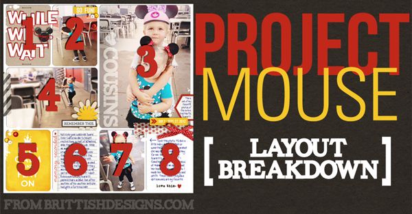
I know when I first started trying out this style I found myself a little stuck on just how to "make it work" as my pal Tim Gunn says. Maybe this will help!
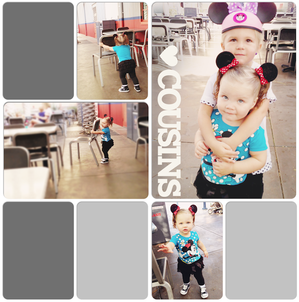
Here's the page I scrapped tonight:

I actually timed myself because I was curious how long I currently take to put together a Project Mouse style page. If you remember - one of my goals in creating pages this way was to see if its really as quick and efficient as I think it is!
Goals of my experiment:
1) To see if I like Pocket Style enough for an entire album.
2) To see how much I miss creating and then looking at traditional pages in my trip album.
--> 3) To see how long it takes, and if pocket-style is really as quick and efficient as I think it is.
Once I had picked out my photos, I set the timer and went to work.
I edited my photos (brightened them up and ran an action on them), decided on my arrangement and got my page laid out. I was already to this point only 11 minutes in!!
The rest of the page took another 40 minutes. So 50 minutes total. Not too shabby, BUT I know I could have been much faster. I got hung up on my title and a couple other dumb things. Plus, I have to keep in mind I'm still getting the hang of pocket style scrapping. The more I do it, the faster I'll get. Also, journaling takes time. Writing it, getting it placed right, etc. So if you're not big into journaling, your pages can probably be done MUCH quicker.
Ok - let's get to the BREAKDOWN!!
Supplies used:
- "Project Mouse: Bundle No. 1" by Britt-ish Designs & Sahlin Studio
- Alpha from "Just Plain Fun" kit by Britt-ish Designs
- staples from "Miss Kitty" kit by Britt-ish Designs
- Mickey button from "The Big Cheese" freebie (aka the add-on to "Miss Kitty") (download is still active)

As you can see, this particular layout has 8 sections or "pockets". I didn't use a template or anything like that. I just used the basic 3x4 and 4x6 cards and arranged them until I was happy. I had 1 photo that I REALLY loved that I knew I wanted to be nice and big, so I took up 2 4x6 spots for it. This is one of the things I love about doing DIGITAL pocket style, you can create whatever arrangement works for your photos instead of being limited to the page protectors.
1) My title card: "While We Wait". I wasted too much time fiddling with my title. I tried to use a font and create sort of a graphic looking title, but it just wasn't working! Grrr. Then I remembered seeing a ton of my Britt Girls use the alpha from my kit "Just Plain Fun" on their Project Mouse pages. Turned out perfect. Added a Mickey head button for accent and a couple staples. I'm addicted to using staples. At the last minute I added some white paint splatters using some free paint splatter brushes I downloaded online. I don't even remember exactly where, I've had them for so long. Oh and & I should mention I also rounded all my corners using the free corner rounding action that's included in our card packs.
2) Just a photo with a word strip and sequins from the Project Mouse embellishments pack. Simple enough!
3) One of my FAVORITE photos from the entire trip. I don't know why, but its just so sweet to me. So I made it nice and big (this is from my PHONE can you believe that? It was plenty big enough right off my phone. I thought a big graphic word overlay would look cute on it, so I added "COUSINS" with the tracking (aka the space between the letters) set to -75. Then I quickly added a heart shape (used the Photoshop custom shape tool). The heart and text were white, but I turned the blending mode to "Soft Light" for a more subtle look. I added a hexagon journaler hanging off the side of the page so it looks sort of like a tab and made a simple date strip in yellow because I realized right side of the page didn't have any pops of yellow and it felt unbalanced.
4) A cropped photo with a flower, word strip, and washi tape from the Project Mouse: Embellishments pack. Easy peasy.
5) I love this card from the Quote Cards Pack. I thought a page about waiting was a perfect time to use it. More white paint splatter brush work. I think I used the splatters to give the overall look of the page a less of a stiff boring feel.
6) One of two journaling cards. This is actually a 4x6 card from the Project Mouse: Basics Card Pack. It's easily cropped to a 3x4 size! Perfect. I'm trying to keep my handwriting font consistent througout my Project Mouse book for this trip. And I had the idea on my first page to make the text blue so it looks like I handwrote it all with a blue ink pen. I sort of love how this looks! The font I'm using is Pea Lauren America. I picked it because I like it AND it sort of looks like my own handwriting! Only cuter.
7) Another photo put into a 3x4 rounded corner spot. Tiny bit of paint splatter in the corner.
8) Another journaling card from the basics pack. Used a little arrow to point to the photo I was talking about. Added a washi tape up top and a bow for a cute girly touch.
DONE!! That's it! Just like that I've recorded some vacation stories, details, photos and memories. I'm still getting the hang of the look and feel I like for my Project Mouse pages. But the more I play, the more I'll nail down the style I want.
I hope this helped you get some ideas when putting together your own Project Mouse pages. Be sure to come share your creations with us at the Project Mouse Flickr Group. There's already a tons of awesome layouts to browse through there. Bookmark it as a place to look for ideas and inspiration!

0 komentar on Project Mouse Page Breakdown :
Post a Comment