Showing posts with label accessories. Show all posts

So you want to hire a decorator


Many people think that working with a decorator is out of their reach financially  or that the results of the pairing would create a space that wasn't personal.  Neither of these beliefs are true if  homeowners  matche their  needs with the right decorator's skill set
 
Professional decorators usually hold a set of  basic beliefs about designing spaces that support  their interactions with clients.   For example I believe
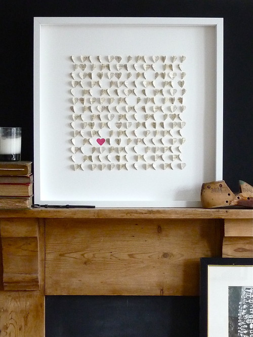
    everyone deserves a beautiful space ....

     
     Margaret Ryall
     
    interesting and inviting interiors can exist without a high price tag;
     
     
    Photography: Brian Ricks
     
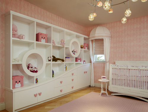
    a space should reflect the needs and interests of the owner;
     
     Margaret Ryall 

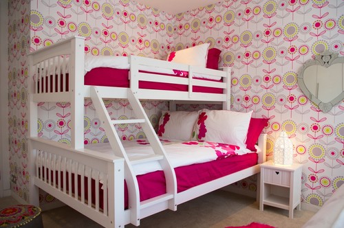
    furniture arrangement makes or breaks a space;


    Margaret Ryall

    personal items are the best accessories;

    Margaret Ryall

    editing a space can transform it;


      Margaret Ryall
     
    layering objects, colours and textures create interesting spaces;

    Photography:  Brian Ricks

    art completes an interior design;

     
    Margaret Ryall

    harmonizing is more interesting than over matching;

    designing a room is the same as designing a painting; 

    and most important of all .... 

    listening is key to designing.
       As you can see these are broad beliefs that can be applied to most spaces. They do not dovetail into any particular look.   Everyone is different and their spaces should reflect  this individuality.  

      My approach: 
      I  compose spaces  in various ways, problem solve situations, use colour to harmonize or contrast; understand the various principles and elements of design and put them together to produce  interesting spaces.   I like to meet clients, find out about them as people, look at their spaces and what they own,  and then create a space  that is personal to them. The key to this process is listening and questioning.

       Do clients  have to love what I love?  NO! Are there projects that are easy for me?  Yes!  I love mid century modern styling and like to mix it with more contemporary pieces for a  clean edged  look with lots of neutrals, texture, splashes of colour and interesting lines to create quiet spaces.

       Can I create  traditional designs?  Yes!   How about eclectic?  Yes!  It's all about understanding the characteristics of these styles and working with the likes/dislikes of the homeowner.    

      Is there a decorator in your future? 

      Have a little heart

      Young children often call Valentine's Day "heart day" .  The heart motif is constantly used in home accessories and these gems aren't just for Valentine's Day; they add lightness and love to your home all year round.   Have you woven any hearts into your home decor?


      This simple, graphic pillow  would look great layered with other pillows that have hits of red. The stitching and asymmetrical layout makes the design.


      Totally Tutorials

      Creating a wrapped yarn heart over a wooden or cardboard heart is so simple.  If you create two different sizes you can hang one inside the other.


      How about Oragne?

      A great activity if you are bored.


      In 1930s Hungary, farmers  personalized the designs of their grain sacks so that they could easily identify the bag while transporting grain, flour or sugar. Some of these distinct grain sacks are being repurposed as decorative pillows for the home.  A pillow with history....


      Design Sponge

      Lots of ideas here for interesting, creative wrapping for your Valentine.


      When you poke around on the internet you will find all sorts of ideas for do- it- yourself art with heart motifs. Most of the really successful ones make use of repetition as the  predominant principle of design.  


      Arnold Schulman Design Group

      This is one spectacular bookcase and the little hits of pink hearts are adorable.
       
      London Interior Designer LLI Design

       Can you find the hearts? 

      Arranging objects - scattering

      And now for Part 2 of my arranging objects series....  Scattering objects to the the edges of a table or mantle can  either create a visual mess or a striking composition using repetition.  Think about how you want to arrange a collection. What do you have in the collection that could be the star or the weightiest object? 

        Scattering objects to the edges of  can create a problem in two ways:

      1. When you arrange objects in a vignette  and you spread the object  along the length of the tabletop from side to side you are pulling  the focus to the edges and the cohesiveness  usually falls apart. 

      Some effort was made in this vignette to have a centre of interest by placing the bell jar and the plant pick in the centre.  Unfortunately height and colour in the plants take command and your eye runs both up and off the edges.

       When you want to anchor your eye the tallest objects  (several massed)  should be placed together.  The shorter ones can  lead to the edges.  This vignette could be arranged like the one below for a stronger composition.


      This is a masterful display in one colour.  It has variety in heights and shapes and the massing of the objects in the classic A formation anchors the eye on the vignette. 


      This is the same solution as above, but the height is added using a dark wall and a painting that  anchors the vignette. 


      While the objects in this vignette are focused toward the edges they are connected by the large circular mirror/sculpture/  I would prefer that the taller objects bank the mirror and the shorter ones approach the edges.  This organization works too. 


             2.    Sometimes you group objects to one side of a tabletop and it creates an unbalanced look. If the 
                    objects are similar in height there is no variety.   


      This composed correction created variety in shapes, heights and placement. You could also reverse the placement and have the lamp on the right which would move the frame away from the other frames on the wall.


      Exception to the rule:
      Although this vignette is on the edge of the counter it is extremely well placed.  It  connects with the strong black vertical  on the left and the black rectangle on the counter.  All work together to create a vignette within a vignette.


      Decor refresh for spring

      New growth always brings with it hope and energy for life.  Once the snow goes I always get a hankering to make changes inside my home.  Now don't get me wrong, these aren't major changes.  I'm more into ten minute additions.  Sometimes I'm willing to commit an hour or two to a special project.
      If you get the spring  hankerings perhaps there's inspiration in these ideas.

      Use a tray to organize a vignette


      Perhaps you have a blaw wooden tray you could spray paint and then organize a colourful spring vignette in it.  Think about what you might already have to add and then buy several filler items.


       A small tray on a bathroom counter adds a fresh look.  Placing a grouping of cut  flowers always adds to any vignette.


      I particularly love groupings of white and muted colours and then a big splash of colour with cut flowers.  Yes,  my biases are showing.  Fresh flowers rule in my life. 

       Plant spring bulbs


      Tall glass vases allow you to see the roots growing .  You have to be on top of the watering if you are going to adopt this idea. Repetition of the same shape always looks good in an arrangement.


      This simple twig wreath adds  additional detail and texture and also helps to cover the pot the bulbs are set in.

      Paint something

       You don't have to repaint a whole room.  There are so many simple painting projects for your home.  If you have a bed perfectly centred on a wall, consider adding a painted headboard all the way to the ceiling.  Simple and very eye catching.


       Bring a simple bookcase to life by repainting the back of it.  A fresh colour like this yellow (which is a hot 2013 spring colour) adds a simple focal point and shows up the grouping of objects and books .


       I love highlighting a porch or entry  door with paint.  You can be brave in your colour choice when you want to add a cheery accent to a small space.


       Coloured islands with light cabinets are everywhere lately.   This is such a fresh look if you have enough nerve to go there.


       Not artistic?  Don't worry.  Choose sculptural artificial flowers and lay them on a canvas painted in a solid colour.  Trace around the shapes with a white coloured pencil .  Fill in the shapes with white paint.  Presto!  Fresh art for your wall.  The simplicity and off center composition of this work makes it. 


      Consider textured wallpaper


       Textured wallpaper is underutilized.  There are so many patters and textures that cover the gamut from very traditional to modern.  No doubt there's something for you.  I like the use of textures to reinforce a dresser make over. This is a great idea for a little girl's room.


      Check out these links and more ideas on  my Pinterest Spring Refresh board.


      Implied lines in design

      Part 3  of composing inviting interiors ...


      Doesn't  implied lines sound very  technical? It refers to  lines from separate objects that run into each other and seem to form a single edge. This is sometimes called a hidden edge. Such visual anomalies cause confusion and/or boredom in our homes (and in artwork).


      I like this well put together vignette and what I'm going to point out is probably the result of  the angle from which the photo was taken, but it works well to illustrate this point.  You can see that the lamp looks like it shares the same edge as the art work.


      This is another shot of the room and  indeed the lamp is placed away from the edge of the artwork.  If it wasn't that is all you would need to do to tweek the arrangement.

      A similar problem is created when you have implied lines set up when  several objects are the same height  in an arrangement.  A prime example of this implied line happens  when  lamps are exactly the same height as a headboard in bedrooms.  Sometimes this works well and other times it doesn't.  You have to decide your intent when doing it.


      There are such beautiful colours and patterns in this room and the designer probably had a  good reason for choosing the lamps shown here.  It is often difficult to determine why choices are made when you can't  see the whole room or you have no understanding of the homeowner intent.  In my humble opinion, I want to see the lamps less overwhelming in pattern and shorter so the headboard shines.  Again that is one person's opinion!  Excitement/interest  is usually created by variety and something has to shine in an arrangement.   I am not fond of  visual competition/fighting.


       In this room the lamps and headboard are roughly the same height and provide a line to support the arrangement of art work that runs beyond the the headboard. A successful use of implied line.


       Then of course there is the room where the masterful designer makes implied lines work to fantastic advantage.  In this space the lamps extend the visual line of the headboard and creates  great bottom weight for the large scale, highly textured  IKEA shade.


        Can you see the implied lines in this dining room?  Your eye runs horizontally on three  levels.  It is boring!  I can say that because it is an old shot of the dining room in my house.  A few simple changes  helped greatly.


       The strong line that ran from the buffet to the railing was broken by moving the buffet to the opposite wall and creating a visual break by hanging long drapes .  These are temporary while my custom order ones are being made.  A new round  light fixture hung lower also helps break the horizontal lines.  Thankfully none of the wood is a orange as the photos suggest!