And now for Part 2 of my arranging objects series.... Scattering objects to the the edges of a table or mantle can either create a visual mess or a striking composition using repetition. Think about how you want to arrange a collection. What do you have in the collection that could be the star or the weightiest object?
Scattering objects to the edges of can create a problem in two ways:
 Some effort was made in this vignette to have a centre of interest by placing the bell jar and the plant pick in the centre. Unfortunately height and colour in the plants take command and your eye runs both up and off the edges.
When you want to anchor your eye the tallest objects (several massed) should be placed together. The shorter ones can lead to the edges. This vignette could be arranged like the one below for a stronger composition.

This is a masterful display in one colour. It has variety in heights and shapes and the massing of the objects in the classic A formation anchors the eye on the vignette.

This is the same solution as above, but the height is added using a dark wall and a painting that anchors the vignette.

While the objects in this vignette are focused toward the edges they are connected by the large circular mirror/sculpture/ I would prefer that the taller objects bank the mirror and the shorter ones approach the edges. This organization works too.

This composed correction created variety in shapes, heights and placement. You could also reverse the placement and have the lamp on the right which would move the frame away from the other frames on the wall.
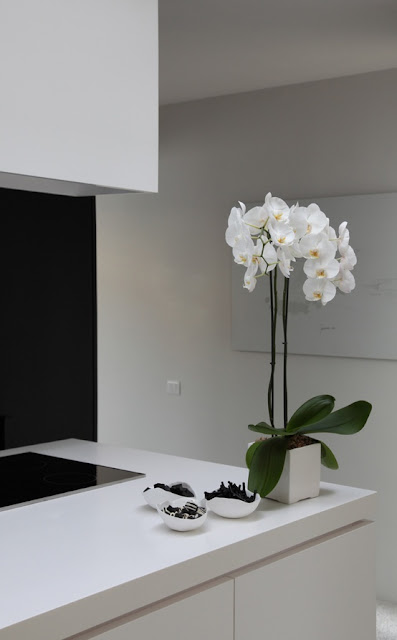 Exception to the rule:
Although this vignette is on the edge of the counter it is extremely well placed. It connects with the strong black vertical on the left and the black rectangle on the counter. All work together to create a vignette within a vignette.
- When you arrange objects in a vignette and you spread the object along the length of the tabletop from side to side you are pulling the focus to the edges and the cohesiveness usually falls apart.

When you want to anchor your eye the tallest objects (several massed) should be placed together. The shorter ones can lead to the edges. This vignette could be arranged like the one below for a stronger composition.


This is the same solution as above, but the height is added using a dark wall and a painting that anchors the vignette.

While the objects in this vignette are focused toward the edges they are connected by the large circular mirror/sculpture/ I would prefer that the taller objects bank the mirror and the shorter ones approach the edges. This organization works too.

2. Sometimes you group objects to one side of a tabletop and it creates an unbalanced look. If the
objects are similar in height there is no variety.

This composed correction created variety in shapes, heights and placement. You could also reverse the placement and have the lamp on the right which would move the frame away from the other frames on the wall.

Although this vignette is on the edge of the counter it is extremely well placed. It connects with the strong black vertical on the left and the black rectangle on the counter. All work together to create a vignette within a vignette.


